
 Submit a Paper
 Propose a Special lssue
 Open Access
ARTICLE
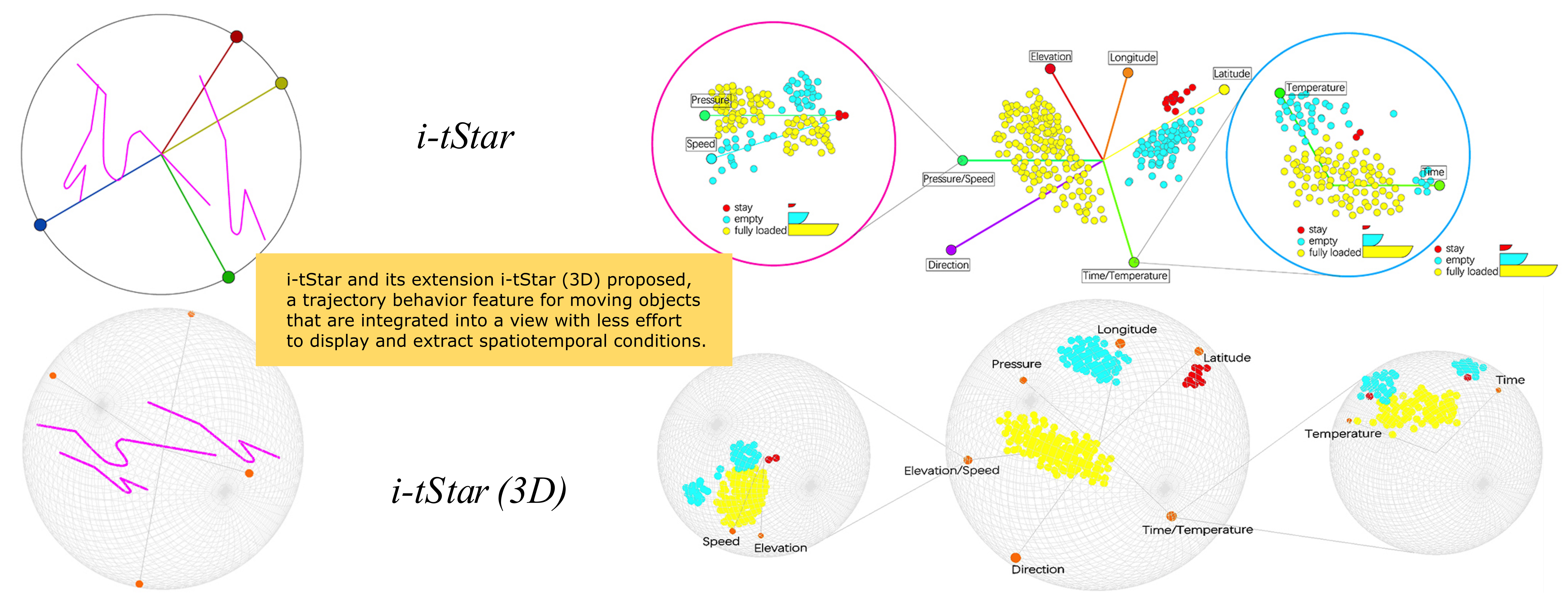
Interactive Trajectory Star Coordinates i-tStar and Its Extension i-tStar (3D)
1 Institute for Advanced Studies in Humanities and Social Sciences, Beihang University, Beijing, 100083, China
2Beijing Key Laboratory of Urban Spatial Information Engineering, Beijing, 100000, China
3 College of Geoscience and Surveying Engineering, China University of Mining and Technology-Beijing, Beijing, 100083, China
4 School of Literature, Capital Normal University, Beijing, 100089, China
5 School of Civil and Hydraulic Engineering, Ningxia University, Yinchuan, 750021, China
* Corresponding Author: Haonan Chen. Email:
(This article belongs to the Special Issue: Computational Mechanics Assisted Modern Urban Planning and Infrastructure)
Computer Modeling in Engineering & Sciences 2023, 135(1), 211-237. https://doi.org/10.32604/cmes.2022.020597
Received 02 December 2021; Accepted 13 May 2022; Issue published 29 September 2022
 View Full Text
 Download PDF
Abstract
There are many sources of geographic big data, and most of them come from heterogeneous environments. The data sources obtained in this case contain attribute information of different spatial scales, different time scales and different complexity levels. It is worth noting that the emergence of new high-dimensional trajectory data types and the increasing number of details are becoming more difficult. In this case, visualizing high-dimensional spatiotemporal trajectory data is extremely challenging. Therefore, i-tStar and its extension i-tStar (3D) proposed, a trajectory behavior feature for moving objects that are integrated into a view with less effort to display and extract spatiotemporal conditions, and evaluate our approach through case studies of an open-pit mine truck dataset. The experimental results show that this method is easier to mine the interaction behavior of multi-attribute trajectory data and the correlation and influence of various indicators of moving objects.Graphic Abstract
Keywords
In the era of big data, we can obtain higher precision motion data. However, with the increase of dimension, the amount of calculation increases exponentially, and the difficulty of visualization also increases. How to solve it? Star coordinate is a high-dimensional data visualization technology, which is most widely studied in the fields of biology and medicine. An interesting application of star coordinates is vista system [1], which uses linear mapping to avoid cluster rupture after dimensional to 2D spatial mapping. Users can use the visual output to confirm the effectiveness of cluster structure. The main disadvantage of this method is that it can only be used for the visualization of dimensional data. So far, several Vista-like systems have been introduced. For example, maps [2], Section [3] and fastmap [4] are constellation-based visualization technologies, which are suitable for generating static clusters for multidimensional data. Since the substantive analysis of trajectory data may involve variables beyond space and time, Gatalsky et al. [5], based on the expansion of star coordinate technology, proposed stretchplot, an interactive positioning technology method similar to star coordinates for multidimensional spatio-temporal trajectory data, which allows users to map trajectory set variables to high-dimensional space and express them as connected linear sequences. It embeds sequential events (and the variables associated with the event) in entities and connects them according to their time sequence to form tracks. However, the way based on track lines is suitable for track sets with a small amount of data.
The behavior pattern mining and visualization of high-dimensional trajectory data face the problem that the data projection method is difficult to obtain data from high-dimensional space and map it to low-dimensional space with minimum error. When the data is complex and dynamic, it is difficult to establish a high-dimensional data mining and visualization model. Therefore, this paper establishes new trajectory interactive star coordinate models i-tStar and i-tStar (3D) for trajectory data of different dimensions. By setting measurement standards, detecting dimension similarity, detecting attribute similarity, reordering attribute axes, interactively manipulating data sets, adding labels to enhance clustering information, and designing an engine to guide cluster perception, Thus, the technical defects of the original Star coordinates are overcome, the star coordinates are applied to the dynamic space-time trajectory data, the technical reliability of the star coordinates for the visualization of high-dimensional data is improved, the layout configuration of the star coordinates is optimized, the cluster discovery is enhanced, and the point cloud clustering effect is better, to mine the evolution law of multi-attribute of any trajectory data set with time and space.
The value of this paper is: Based on the designed i-tStar and i-tStar (3D) methods, display the attribute patterns of mine trajectory data samples, and mine their internal associations and laws; the process of clustering exploration of the star coordinate system is realized, and a variety of interactive means supporting the design are displayed; based on the attribute merging method, the interaction behavior of multiple attributes is analyzed, and the correlation and influence of various indexes during tramcar operation are explained; the point cloud aggregation effects of i-tStar and i-tStar (3D) methods are compared. The experimental results show that the two methods can effectively realize the behavior pattern mining and visual analysis of multidimensional trajectory data.
In Star Coordinate, data points are represented as points, and data dimensions are represented by axes, i.e.,
where n is the data dimension and
Projecting high-dimensional data into a two-dimensional space inevitably introduces overlap and blur, even bias. This means that multiple points in the k-dimensional space can be mapped to one point in Cartesian space. In addition, the vector addition in the space of Star Coordinates must be valid to project all data points correctly on the Star Coordinate. However, the original Star Coordinates is converted to a range of
3 Improved Star Coordinates: Interactive Trajectory Star Coordinates i-tStar
Due to the above defects of the original Star Coordinates, it is not suitable for spatiotemporal data and semantic data. Therefore, it is necessary to evaluate the axis arrangement of traditional Star Coordinates and the quality of point cloud layout to establish a framework for a new interactive Star Coordinates model. Before doing this research, the technique was first named: interactive trajectory Star Coordinates (i-tStar).
3.1 i-tStar Optimization Design
Initially, the i-tStar design only adjusted the arrangement of the original Star Coordinates. There are still three problems: 1) it depends on the adjustment of the visual parameters to identify the overlap in multiple frames (visualization results are considered as frames); 2) visual distortion is inevitable, and the retained data clusters may overlap each other in the visualization; 3) the number of dimensions affects the view layout. When a small number of dimensions are involved, the layout produced by i-tStar is clear and readable (Fig. 1a). As the number of dimensionalities increases, the layout begins to get confused (Fig. 1b). When added to more dimensions, the results may become unreadable (Fig. 1c). Therefore, the scalability of i-tStar will be improved by redesigning from two aspects of point layout and axis. Among them, to adapt to the spatiotemporal feature of the trajectory data, the dimensions and attributes in the axis layout are separated.
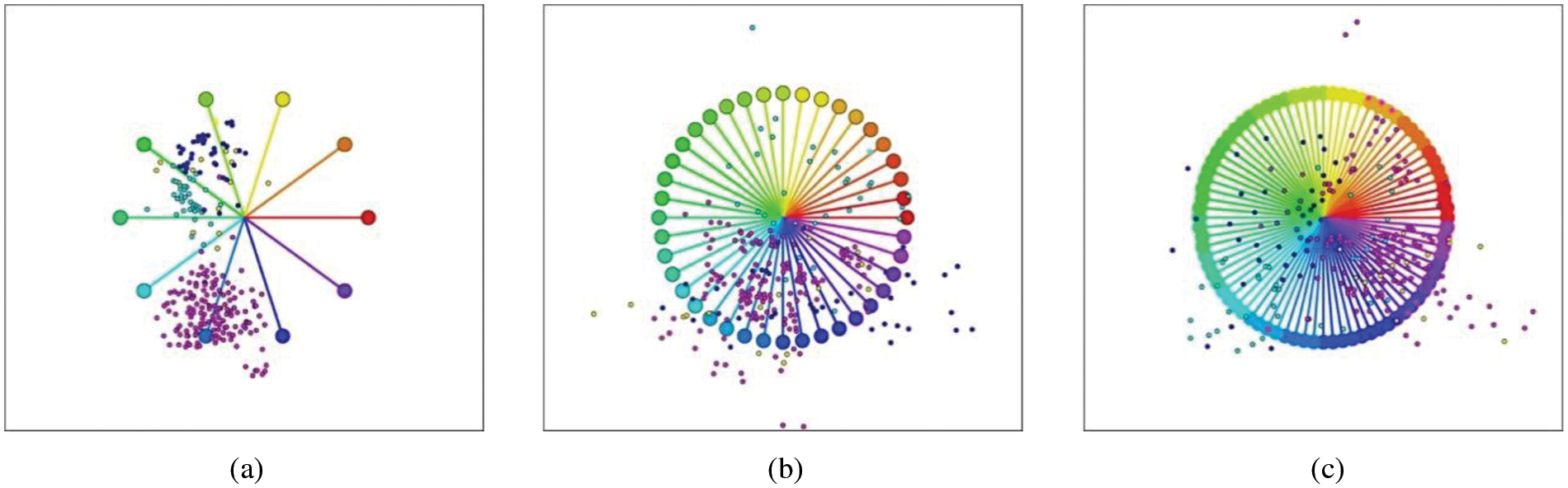
Figure 1: Original i-tStar layouts with different dimensionalities: (a) 10 dimensions, (b) 40 dimensions and (c) 80 dimensions
3.1.1 Dimension Similarity Measure
The dimension arrangement idea of i-tStar visualization technology is to rearrange the data dimensions according to the similarity of data, that is, the similarity data dimensions are adjacent to each other. In order to deal with large-scale dynamic trajectory data sets, i-tStar uses three methods to measure the similarity between two data dimensions, namely distance dissimilarity (DSIM), Pearson correlation coefficient similarity (PSIM) and cosine similarity (CSIM). The calculation is as follows:
The similarity matrix is defined as
3.1.2 Attribute Similarity Measure
The
where m is the number of instances and
The PCA method is used to measure the similarity between attributes, and each attribute is treated as a point in the
The K-Means clustering algorithm groups similar attributes [9], and the centroid mechanism identifies similar attributes based on the cluster information. Specifically, given a training set, it is desired to group the data into several clusters. K-Means is intuitively represented as an iterative process that starts by guessing the initial clustering centroids and then repeatedly assigns samples to the closest centers, recalculating the centroids based on the assignment. The inner loop of the algorithm repeats two steps: assigning each training sample to its closest centroid, and recalculating the mean of each centroid using the points assigned to it. Note that the fusion solution may not always be ideal and depends on the initial setting of the center of mass. Therefore, in practice, the K-Means algorithm is usually run several times with different random initializations, and one way to select these different solutions from the different random initializations is to choose the solution with the lowest cost function value (distortion).
The centroid
where
Through the above method, each calculated attribute of each group is arranged on i-tStar to generate each attribute axis, and the axis length is set to
Arranging the dimension axes and attribute axes correctly is critical to revealing the patterns in the i-tStar layout [10]. i-tStar offers two mechanisms for automatically arranging axes, one based on combinatorial optimization and the other based on a powerful mechanism. According to the similarity measure described in Section 3.1.2, if the similarity matrix S is a
where
The above steps provide the order in which the axes are placed. Next, a simple scheme for setting the angle 3 between axes 1 and 2 is introduced. Let W be the sum of the weights of the best paths found by the reordering process, then the angle maps to:
The forcing mechanism distributes the axes evenly in a uniform circle and then swaps their positions to find the optimal configuration. The layout evaluation is performed based on the layout quality metric, and the topology protection and the Dunn index are also used as quality indicators. Fig. 2 shows the axis configuration based on the optimization mechanism and the forcing mechanism rearrangement using simulation data. The combination optimization method changes the initial configuration, while the forcing mechanism only swaps some axes.
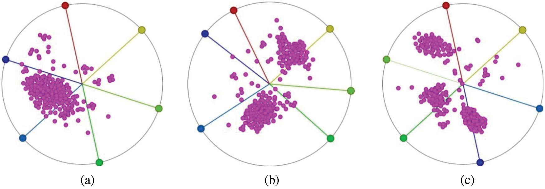
Figure 2: Visualization of 200 instances with 6 attributes (a) In the original configuration, (b) Reordered by optimized configuration and (c) Reordered by forcing mechanism
3.2 Interactive Manipulation of Dataset Adjustment
In i-tStar, the purpose of interactive exploration is to distinguish between visually overlapped clusters.
The normalized range
Therefore, to make
Adjusting
The interaction of parameter range settings is an important factor affecting interactive cluster visualization [12]. Because the purpose of exploration is to distinguish visually overlapping clusters, it is hoped to maximize the utility of each interaction (such as parameter adjustment) towards the goal. It is well known that linear mapping does not destroy clusters, but may lead to cluster overlap. Fig. 3 shows the original data distribution from the simulated dataset, which contains 100 data points and 4 clusters. Fig. 3a depicts the raw data distribution of the dataset. Fig. 3b uses the K-means clustering algorithm to cluster and show its distribution, with some clusters creating an overlap. Fig. 3c is a
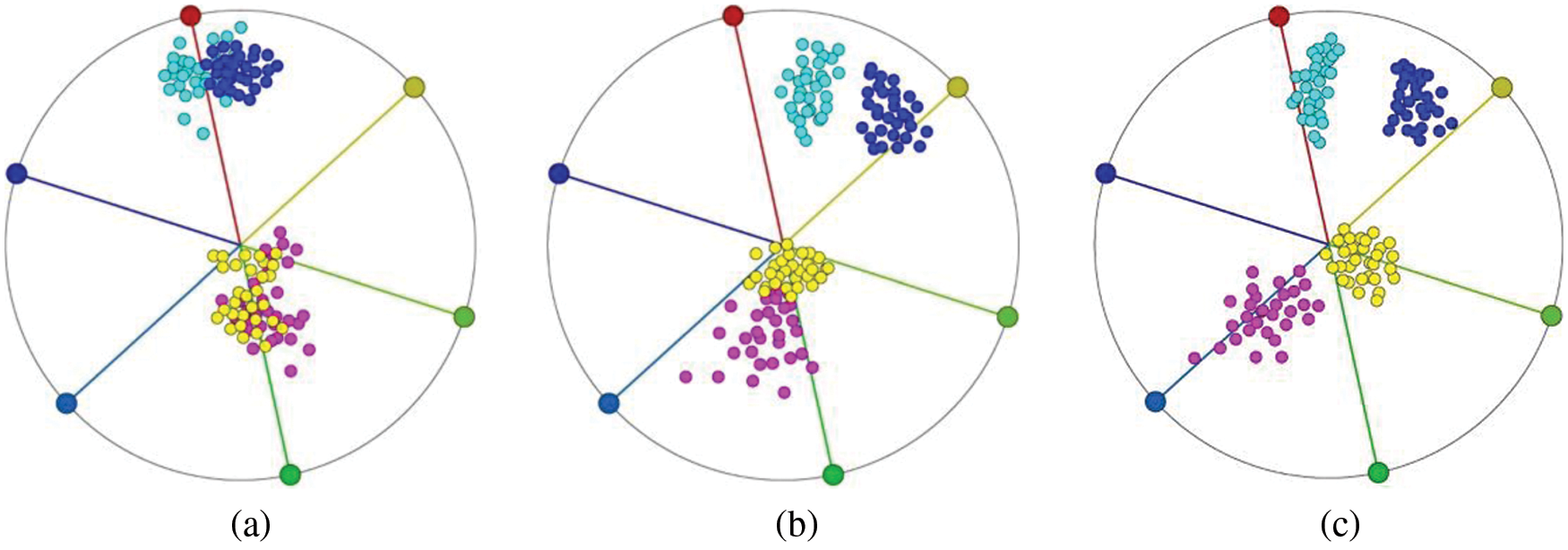
Figure 3: (a) Original data distribution of data clusters; (b) Original data distribution of dataset created by K-means; and (c) Dataset visualization after the
The scaling of data manipulation allows the user to change the length of one or more axes simultaneously, thereby increasing or decreasing the impact of a particular column of data (specific dimensions or features) on the visualization results [13], the basic idea is to recalculate the contribution of the attribute by multiplying the ratio and the “mapping” formula, and re-mapping according to the new scaling factor, as shown in the following equation:
By using axis scaling interactively, the user can observe the dynamic change of the data distribution, which is:
where
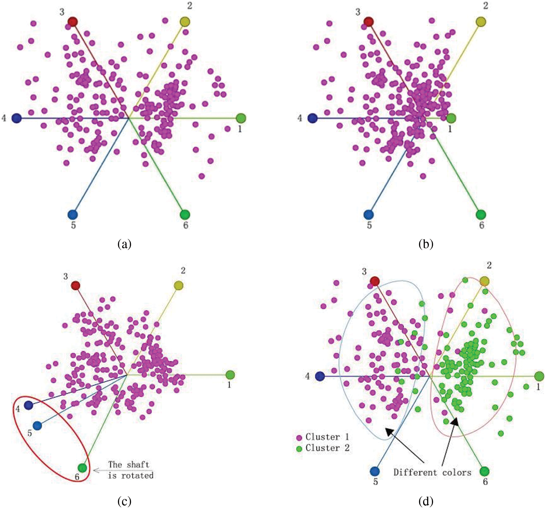
Figure 4: Visual clustering results of i-tStar (a) before interactions, (b) after axis rotation, (c) after axis scaling and (d) after attribute coloring
Rotating axes make a particular data attribute more or less related to other attributes by modifying the direction of the axis unit vector and changing the correlation of the corresponding feature axis to other feature axes. The immediate benefit is to effectively solve the overlap problem, and help the user distinguish clusters that may be mistakenly overlapped. Model the Star Coordinates using the Euler formula:
Among them,
The user can rotate a particular property by adjusting the angle value of the axis, recalculating and re-mapping the data as the angle changes. Fig. 4c shows the results of point clustering after the axis is rotated.
Coloring is the classification of data based on similar factors, and assigns colors to each set of factors to achieve visual or clear clustering of information data distribution. It creates another dimension of data visualization, which can be classified as an interactive feature because the user is free to choose different color values in the various color representation dimensions. Based on the same data, Fig. 4d clearly indicates the two generated clusters.
3.3 Tag Enhancement for Different Clusters
As described in the literature [14], when the number of dimensions exceeds 50, the use of user interaction does not effectively visualize the data, and the cluster overlap problem cannot be solved. It can be found that this problem could be solved by marking a small amount of data in i-tStar. The tag information used for data clustering is identifiable. According to the experimental situation, satisfactory results can also be obtained by using limited tags, i.e., unsupervised clustering [15], including available scenarios for two clusters and more than two clusters.
3.3.1 Discussion of a Two-Cluster Scenario
There are two types of tags that can be used for the data portion of the tag. One set of k-dimensional samples
In Eq. (14),
3.3.2 Discussion of a Scenario with More Than Two Clusters
If there are more than 2 clusters (
among them,
The generalized form of
where
Using the generalized Eq. (19), it can be got:
where
By maximizing
In the configuration described above, the visual perception of the cluster is enhanced. However, when visualizing higher dimensional data, even if a possible parameter adjustment method is provided, it is difficult or even impossible for the user to achieve favorable adjustments. Therefore, this section attempts to solve this problem using cluster recognition to achieve the separation of target clusters with a minimum number of interactions.
The engine design consists of three steps, including information object transformation, dimension mapping, and interactive functional design. Step 3 has been explained in Section 3.2. Steps 1 and 2 are described below.
Suppose the target dataset is a six-dimensional dataset with six attributes
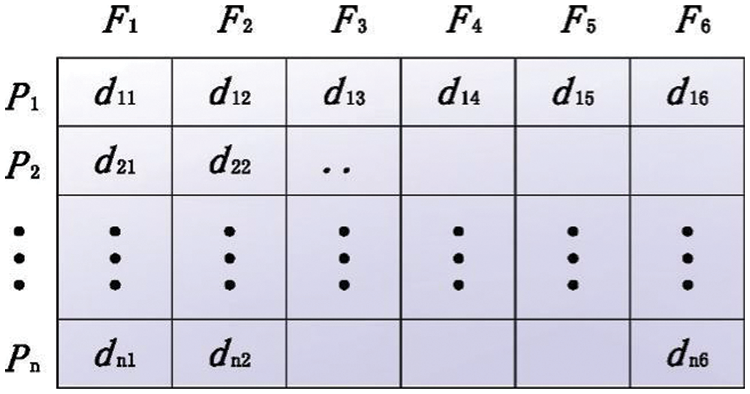
Figure 5: Information objects of matrix transformation
Step 2 involves mapping each information object onto an axis. The axis representing the dimension
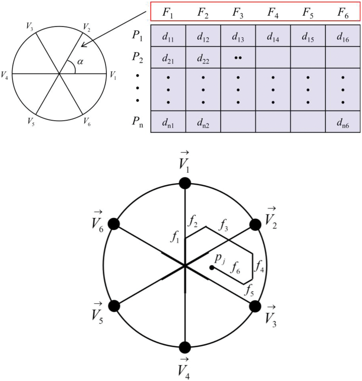
Figure 6: Mapping architecture
The cluster detection of Star Coordinates not only improves the efficiency of axis operations with higher cluster quality, but also allows users to analyze the relationship between cluster and data attributes. To achieve this goal, Approximated Silhouette Index (ASI) could be used [17] to assess cluster quality based on inter-cluster distance and intra-cluster distance. This approach requires the construction of an SI view to inform the user of the quality of the real-time projection.
To get the best projection matrix, the maximum global contour index is obtained by the energy function, it can be expressed as:
where n is the number of data points,
Let
The projection space can visualize and explore the influence of different data attributes when separating point clouds. Therefore, the quality of the clustering structure is evaluated by calculating the contour index
The constructed SI view is used to reflect the quality of the real-time projection point cloud. The whole process is as follows: First, the data points in each cluster are sorted in descending order of SI value
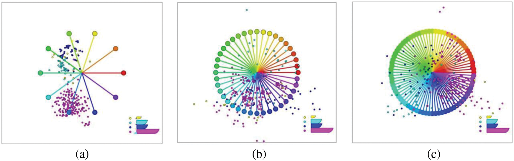
Figure 7: Distribution in SI views
4 Extended Three-Dimensional Star Coordinates: i-tStar (3D)
i-tStar is designed to display multidimensional data in a two-dimensional visualization space, and its natural extension is to extend the visualization space to three dimensions [18]. This approach extends the data exploration space and helps discover subtle patterns hidden in the 2D space, but two flaws still exist: the original data symbols cannot be preserved (no signals in the Star Coordinates), and the opposite axis configuration (two irrelevant attributes may cancel each other out). This section will introduce a 3D visualization algorithm for complex high-dimensional data, which extends i-tStar to 3D star coordinate system, which is called i-tStar (3D) in this paper.
4.1 Spherical Star Coordinates
4.1.1 Spherical Coordinate Visualization Model
The spherical coordinate visualization model is shown in the following equation [19]:
where v is the original value and
Here, the vector
In order to distinguish the visual differences between i-tStar (3D) and i-tStar, the three-dimensional Star Coordinates are combined with the spherical coordinate system.
4.1.2 Selecting an Automatic Algorithm for Projection Configuration
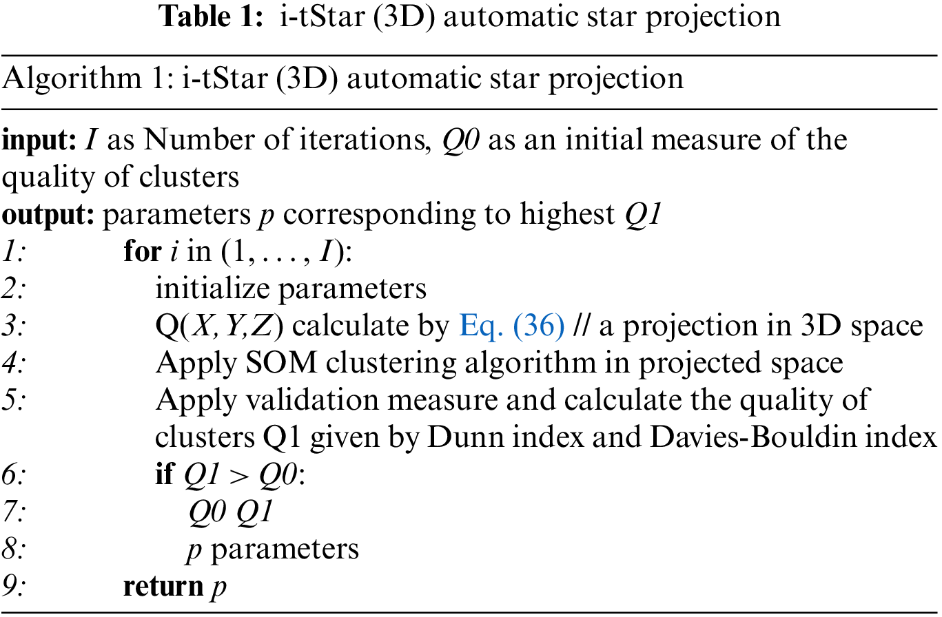
The process of manual intervention to determine the optimal configuration for projecting high-dimensional data in low-dimensional space [21] is cumbersome and may need to browse a large number of configurations. The proposed algorithm will enable the user to obtain the best projection by eliminating the need for manual browsing in all possible configurations, as shown in Table 1.
If there is a large number of dimensions and records in the dataset, it is effective to combine semi-supervised clustering with three-dimensional visual clustering, that is, to find the optimal projection distance metric given by the matrix M. The following are several alternatives for modeling and evaluating the best projection distance metrics for advanced data analysis, interactive visual clustering flexibility, and manual parameter adjustment.
4.2.1 Spherical Coordinates and Normative Discriminant Variables
If using the category label for annotation, the canonical variable [22] can be used to get the spherical coordinates of the optimal projection distance metric M. According to Bishop [23], the canonical variables of the three-dimensional projection can be obtained as follows:
For each cluster, first form the Mahalanobis covariance matrix
Using μ, the average of the entire dataset and
An optimal projection matrix
After obtaining the projection matrix
If
4.2.2 Projection Distance Metric
The use of Fisher discriminant analysis usually makes implicit assumptions about the polynomial distribution of the data. When there is no specific assumption of the data distribution, the distance metric can be obtained from the set of similarity and dissimilarity pairs by optimizing the function of reducing the distance between similar items while increasing the distance between different pairs of items. When exploring the projection distance metric M of a dataset separated in a three-dimensional projection space (rather than the original space), it is defined as the distance between two items
For the case of processing a set of similar pairs S and a set of dissimilar pairs D, assuming that some items
4.2.3 Comparison Algorithms of i-tStar (3D) and i-tStar
To illustrate the efficacy of the i-tStar (3D) algorithm, the performance of i-tStar (3D) was compared with that of the i-tStar, and simulated data sets were used in the empirical analysis. The simulated data is composed of three types of Gaussian distribution data in five dimensions, and the mean and covariance matrices used are given by the following formula:
Fig. 8 shows the results obtained using i-tStar and i-tStar (3D) projections. The i-tStar (3D) algorithm seems to render better visualizations because of the clear images involving three classes. This may be due to the fact that in some data sets, the projection obtained by the i-tStar algorithm involves more fuzzy indications of classes than the i-tStar (3D) algorithm, and data points are relatively sparsely distributed with no clear boundaries between two of the three classes involved.
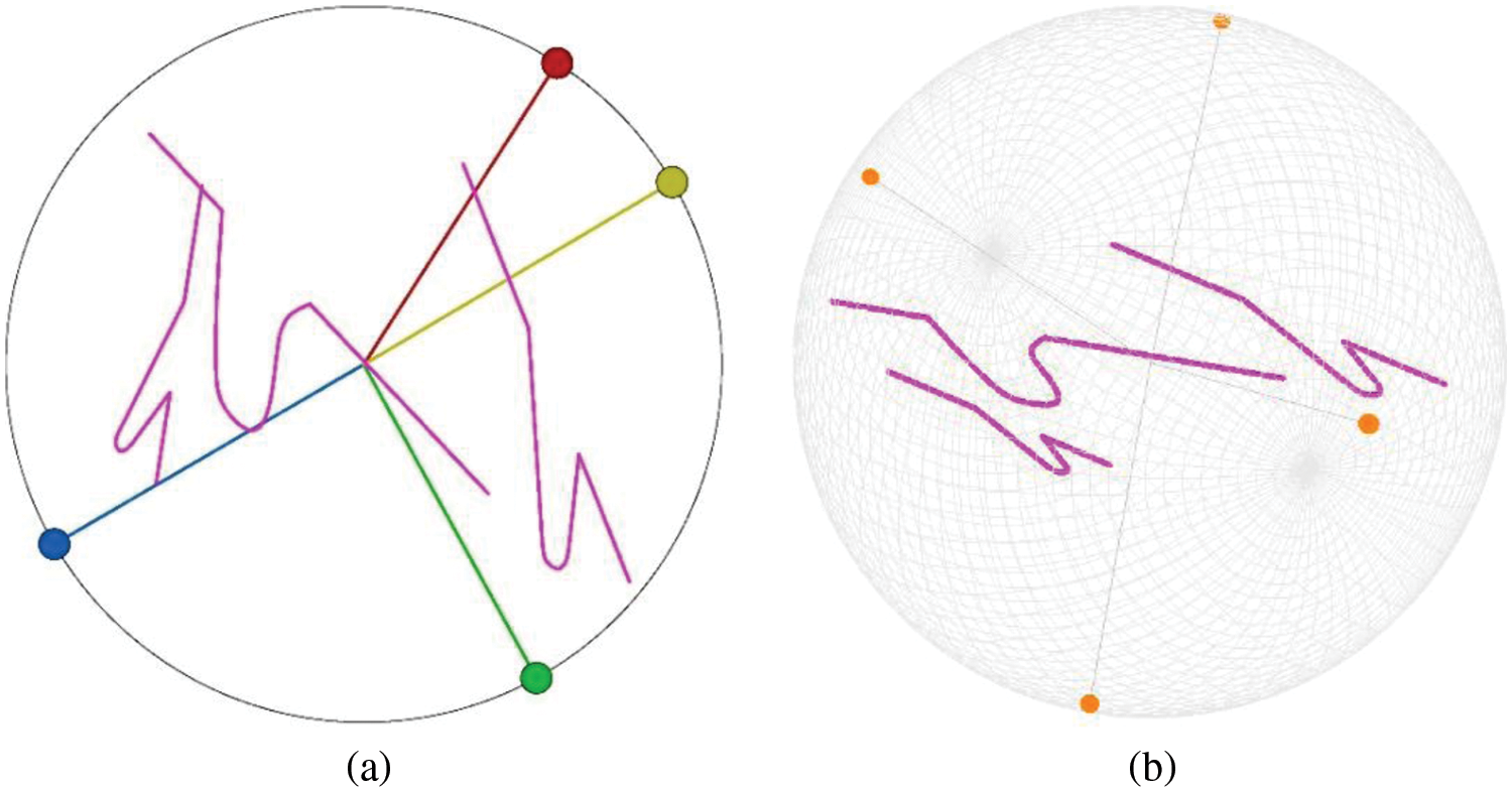
Figure 8: Projection results of simulated dataset on (a) 2D star coordinates and (b) 3D star coordinates
In the mining field, open pit mining processes often rely on large mining trucks as the primary means of transport. According to the GPS receiving module installed on the mining truck, the GPS satellite signal is periodically received to obtain the real-time three-dimensional coordinates of the truck, and a large amount of trajectory data is accumulated as the truck moves continuously. The mine car data has general features or metadata combined with spatiotemporal data, the spatial dimension of which exists in the expressed geolocation characters, and the time dimension represents the continuity of these data over time. As a result, these data are multidimensional in space and time. Moreover, the movement process of the mine car is accompanied by changes in direction, speed, tire temperature and tire pressure, which constitute the variable data of the mine car, which is the property of the mine car. Therefore, our dataset represents continuous time data collection for a mining area in Inner Mongolia, China, from June 28, 2016 to August 30, 2016, it consists of four-dimension (three-dimensional geospatial, time) and four-attribute-trajectory data (direction, speed, tire temperature, tire pressure). To facilitate visualization, instead of distinguishing between multidimensional and multivariate conceptual operations, they are treated as data instances of eight dimensions that describe the statistics of all the relevant information that the mine car has. This paper hopes to use i-tStar and i-tStar (3D) to realize the mining and visual modeling of a high-dimensional trajectory dataset.
5.2 Clustering Visualization and Interactive Results of i-tStar
5.2.1 Visualization Results of Star Coordinate Markers Based on Uniform, DSIM, PSIM and CSIM
We use DSIM, PSIM and CSIM to measure the similarity between the two data dimensions, and then use the data set visualization of the proposed multi-class method to confirm the best visualization effect of the number of tags. Figs. 9a to 9d show the visualization results of uniform star coordinates, i-tStar of DSIM based dataset, i-tStar of PSIM based dataset and i-tStar of CSIM based dataset, respectively. It can be seen that some clusters are overlapped based on uniform star coordinates, which cannot achieve the perfect separation of clusters, including some mixed clusters. The latter three methods of configuring constellation coordinate layout can better separate clustering. All modified star coordinates are better than standard star coordinates, and the i-tStar visualization effect of the data set based on DSIM is the best.
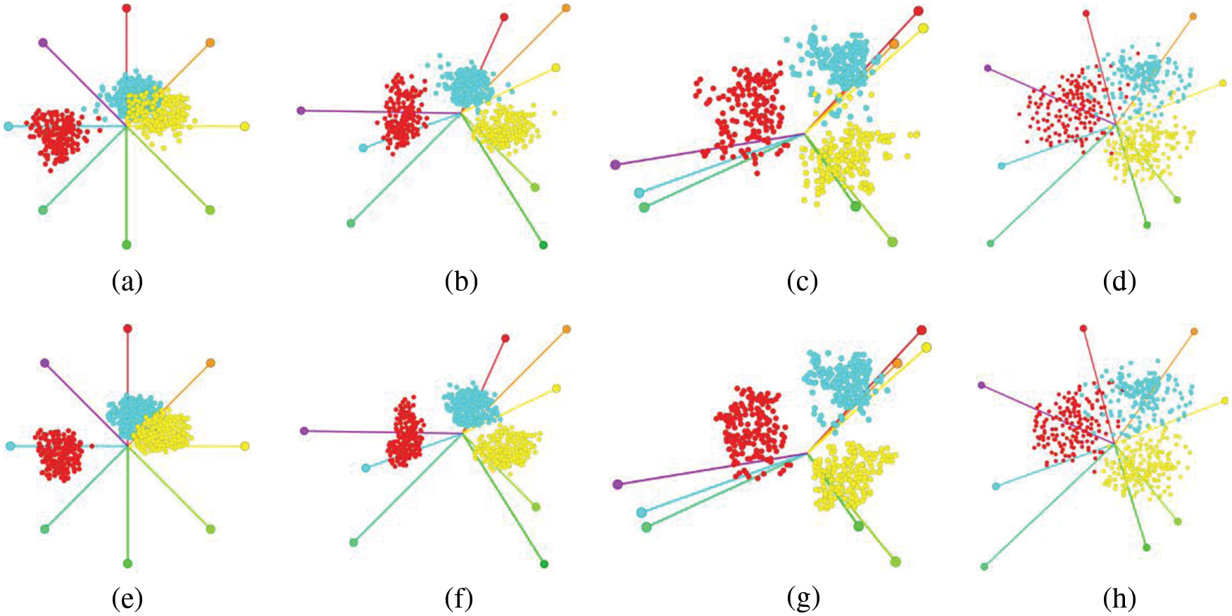
Figure 9: Uniform star coordinates (a); and i-tStars based on DSIM (b), PSIM (c), and CSIM (d). (e–h) Fully automated multi-class results, where
In order to visualize multiple clusters in multidimensional trajectory dataset, one visual space is not enough to show the separation of clusters. The visualization of dataset using the proposed multi-class method effectively solves this problem. In this case, samples from multiple classes are randomly selected as marker data input. As shown in Figs. 9e∼9h, we marked a small number of data samples, including 3 samples from the class, 4 samples from the class and 5 samples from the class. Although the number of labeled samples will affect the proposed method, the results are satisfactory over a wide range of values. We show that the best data visualization is achieved where the axis is adjusted until the mapping point cloud (cluster) in the mapping plane is as dense and separated as possible. I-tStar aims to achieve this optimal mapping. Even if the number of labeled samples is limited, users can easily identify the visual results using a set of labeled samples. This method automatically and clearly shows the clustering without any direct user participation. And the minimized cluster overlapping region proves the effectiveness of i-tStar, and the results are very close to our previous reasoning. Therefore, our subsequent experimental data visualization is based on the labeled DSIM i-tStar.
5.2.2 Attribute Interaction Behavior
Then do further analysis and merge the relevant attributes. The PCA-based clustering algorithm is used to cluster some attributes of the dataset. This process is a collection of the time axis and the tire temperature axis, the speed axis and the tire pressure axis. The axis starts at 12 o’clock, and clockwise is the elevation axis, the longitude axis, the latitude axis, the time/tire temperature axis, the tire pressure/speed axis, and the direction axis. The attributes assigned to the same axis indicate that they are highly correlated. (tire pressure and speed, time and temperature). The i-tStar visualization results are shown in Fig. 10a. After cluster identification, it can be seen from Fig. 10b that the layout also shows three clusters of stay, no-load, and full-load (the stay point accounts for about 5%, the no-load point accounts for about 30%, and the full-load point accounts for about 65%).
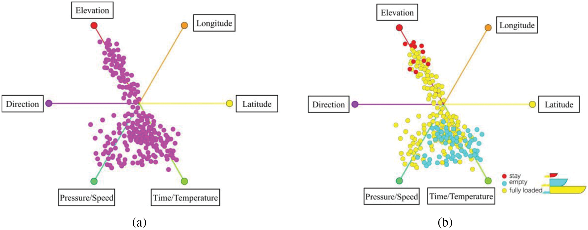
Figure 10: Clustering of partial attributes
The initial state of the six-dimensional experimental process and the clustering result generated by the interactive manipulation process are also indicated, and the link between the SI view and the projected view is also implemented to show the importance of the cluster, as shown in Fig. 11, it shows i-tStar attribute clustering based on PCA and variance, in addition of 11 different layouts of the produced dataset that rearranged. The distribution of point clouds has changed, as well as the discrete and aggregated features of the cluster.
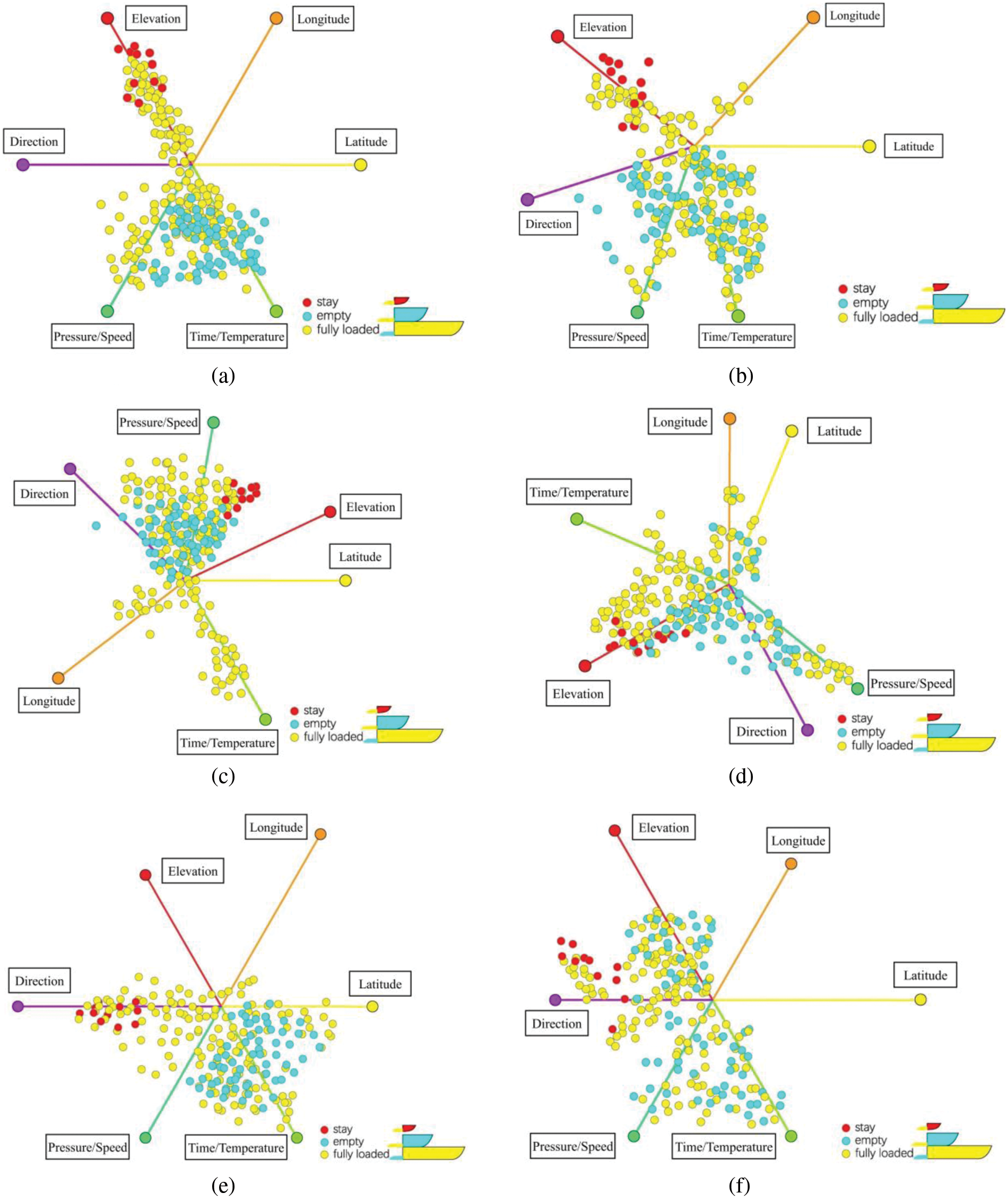
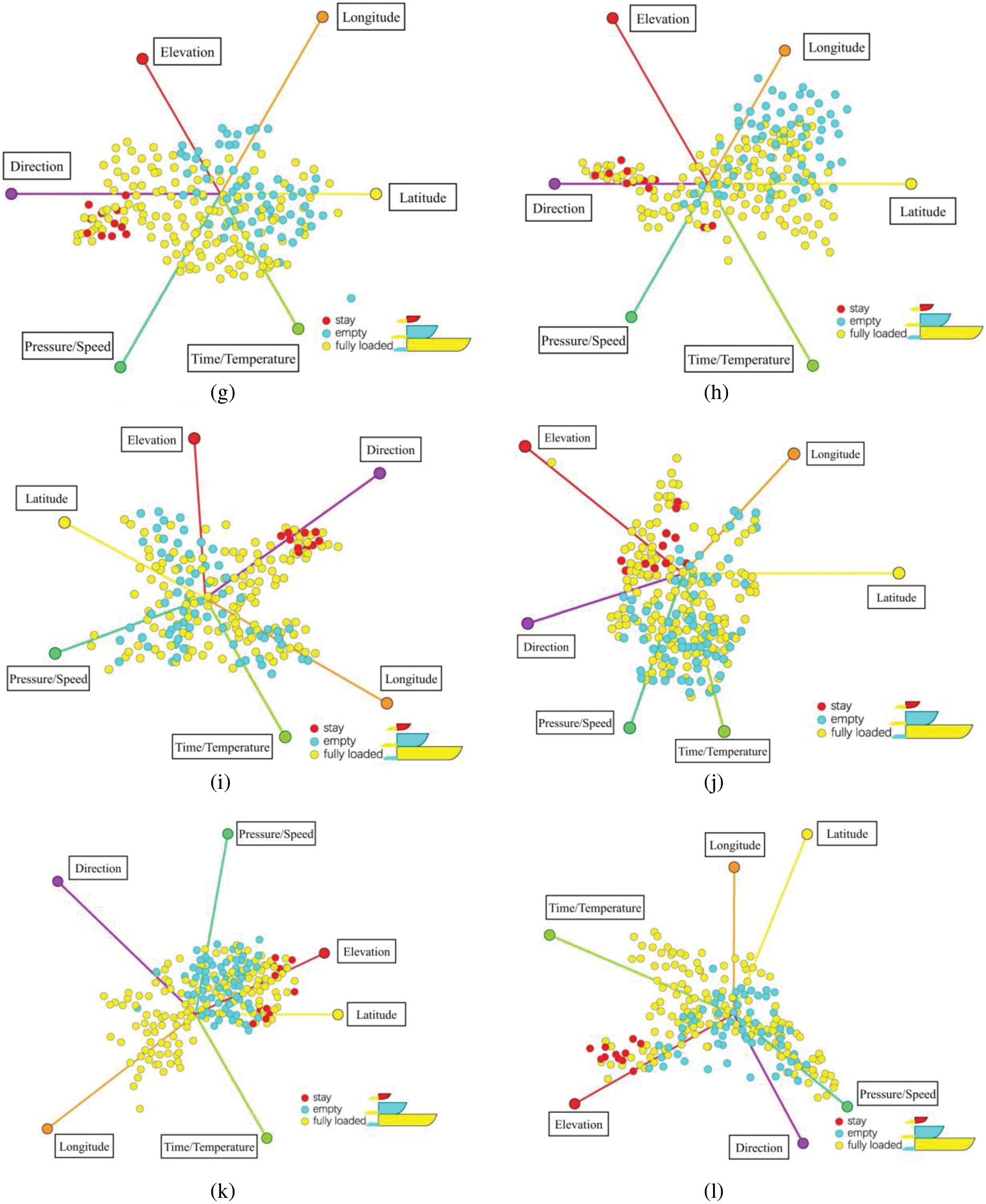
Figure 11: Layouts after attribute reordering. (a–d) Clusters after user interactions; (e–h) i-tStar projections based on PCA clustering; (i–l) i-tStar projections based on variance
Fig. 12 illustrates the actual interactive resource operations. For example, certain attributes first perform scaling and rotation operations interactively to better differentiate three clusters (fully loaded, empty, stay), and move interactively from one cluster to another. In Fig. 12a, the combined attributes use time and tire temperature, speed, and tire pressure as clustering attributes. In Fig. 12b, the combined attributes use time and tire temperature, speed, and elevation as clustering attributes. The reason for this is that the tire pressure property in Fig. 12b has moved from the red axis to the green axis, and the elevation attribute has been swapped. The lens is used to describe the contents of the clustered axis.
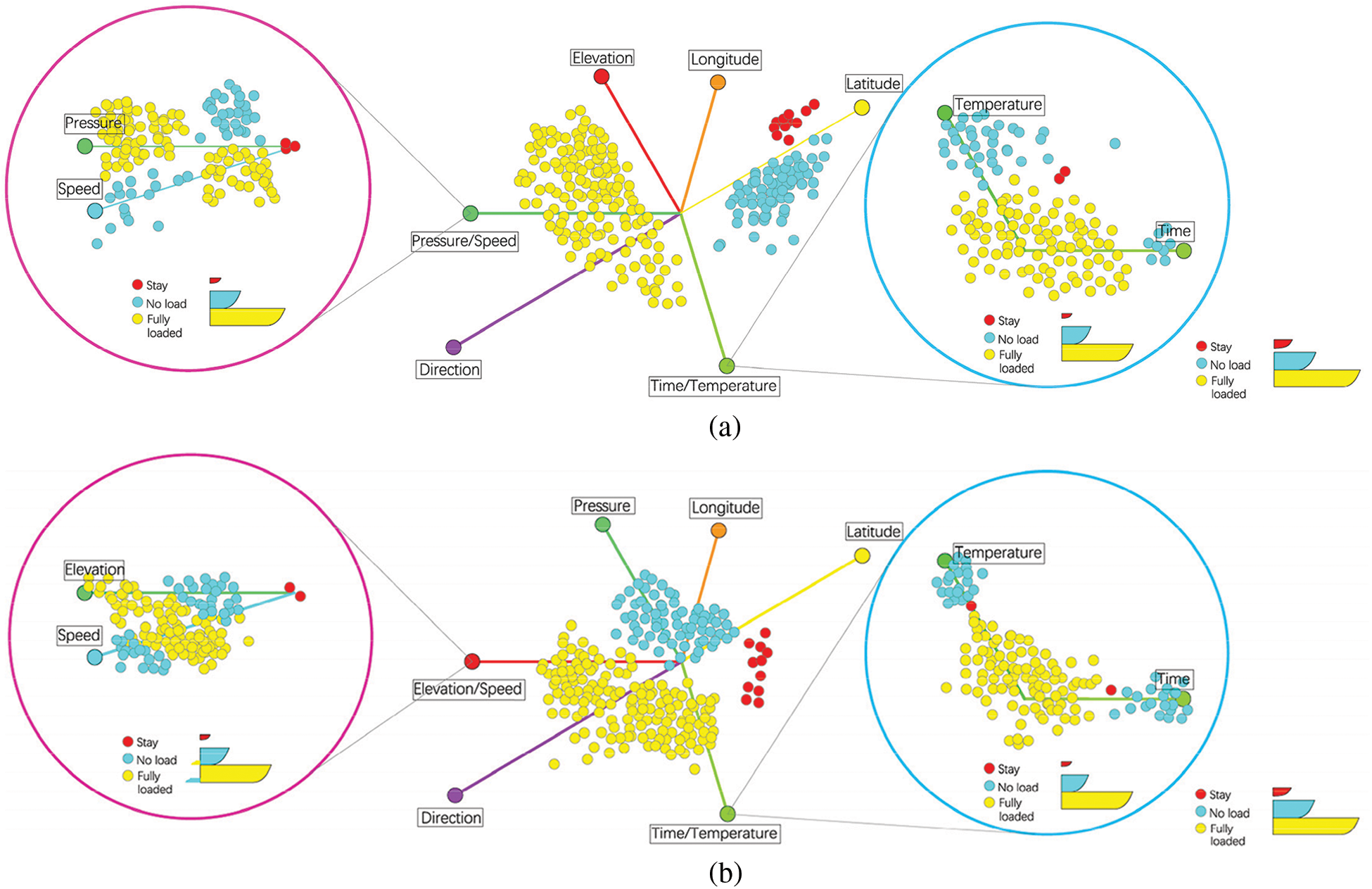
Figure 12: A new cluster is uncovered and clearly defined after certain interactions on the final projection
Fig. 12a shows that in the purple lens, the clusters with high-pressure values and low-speed values represent fully loaded trucks, and those with low-pressure values and high-speed values indicate empty trucks. The stay point is observed at the vicinity of the two axes and the origin, which indicates that the tire pressure and speed are significantly affected and the two values cancel each other out during the stay; in the blue lens, the clusters of empty trucks exist in the place where the time and temperature values are large, and the clusters fully loaded trucks exist in time and the temperature values are small or where the two axes are close to the origin. The position of the stop point indicates that the dwell state is not related to temperature and time, and the correlation between the two is stronger.
Fig. 12b shows that in the purple lens, where the pressure value is high and the elevation value is low, most of the clusters are fully loaded trucks. Where the pressure value is low and the speed value is high, most of the clusters are empty trucks, and the stay point is on the axis. In the blue lens, most of the empty-truck clusters exist in places where the time and temperature values are great, and most of the full-truck clusters exist in places where the time and temperature values are small or the neighborhood of the origin. Although the distribution of point clouds differs from Fig. 12a, the overall trend is the same, and the time, elevation, tire temperature, tire pressure, and speed are highly relevant to the three clusters. These visualizations further validate the behavioral patterns of multi-attribute interactions in mine cars.
In general, i-tStar achieves better data mining and visualization effects in high-dimensional relationship distribution, and can classify non-numeric data, that is, clusters are visualized during data mapping, and i-tStar shows the dispersion distribution of attribute correlations. Although the degree of separation between some clusters is small, it can be seen that all clusters are separated from each other.
5.3 i-tStar (3D) Cluster Visualization and Interactive Results
Similarly, by doing similar operations in i-tStar (3D), the following visual views can be obtained in Figs. 13–16.
Figure 13: (a) Uniform 3D star coordinates; and 3D star coordinates based on (b) DSIM, (c) PSIM, and (d) CSIM. (e–h) Using a fully automated multi-class approach based on (a–d), where
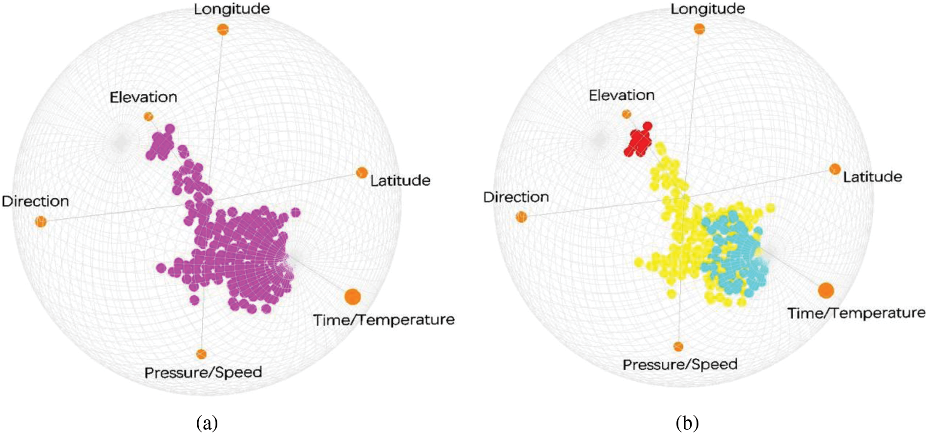
Figure 14: Visualization results with partial attributes clustered
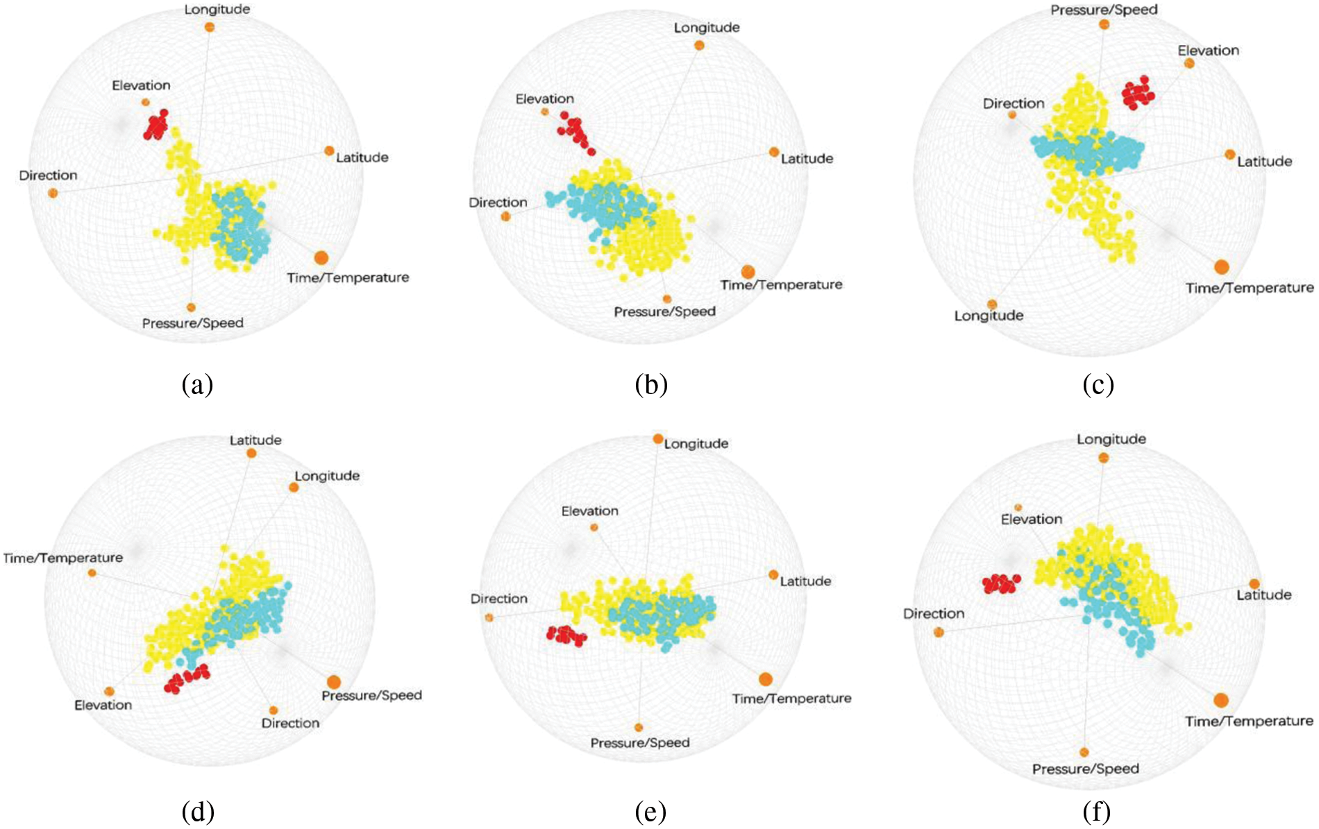
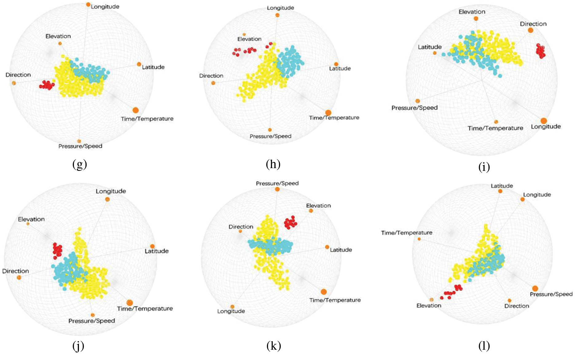
Figure 15: 3D layouts after attribute reordering. (a–d) Clusters after user interactions; (e–h) i-tStar projections based on PCA clustering; (i–l) i-tStar projections based on variance
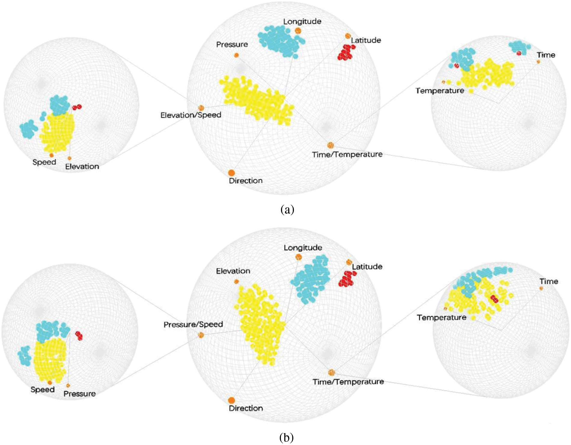
Figure 16: A new clearly defined cluster is uncovered after certain interactions on final projection
5.3.1 Visualization Results of Star Coordinate Markers Based on Uniform, DSIM, PSIM and CSIM
We express the visual presentation using i-tStar in Section 5.2.1 in the form of i-tStar (3D). The automatic configuration of i-tStar (3D) reveals the hidden mode in complex data sets without human intervention. On the premise of necessity, semi-supervised clustering is realized.
5.3.2 Attribute Interaction Behavior
5.4 Comparing i-tStar with i-tStar (3D)
The experimental results show that in i-tStar, the basic representation of data is essentially two-dimensional, the display is essentially two-dimensional, and the input device is essentially two-dimensional. When there is no obvious separation between two of the three classes in the i-tStar display database, the result is similar to the scatter diagram. On the contrary, the projection results produced by i-tStar (3D) projection algorithm have clear category separation, clear boundaries and compact clusters, that is, it provides a better data trend than i-tStar projection. Therefore, to some extent, it can be explained that compared with the visualization technology of i-tStar, i-tStar (3D) reveals the hidden patterns in the data and helps to better visualize the complex high-dimensional data.
As a valuable extension of i-tStar, i-tStar (3D) not only retains all the functions of i-tStar, but also provides and makes use of the new three-dimensional aspects of the system. It is easy to note that i-tStar (3D) projection has a higher degree of freedom because i-tStar (3D) visualization algorithm defines a process to select the best configuration for 3D projection using clustering validity index. In general, compared with i-tStar technology, i-tStar (3D) has the following advantages: 1) System rotation allows to maintain the configuration of data while considering different views; 2) The infinite expansion of the volume relative to the surface allows easier discovery of the structure of the data; 3) The attribute reference provided can be used to perform more complex multivariate analysis.
Based on the original Star Coordinates in high-dimensional data visualization technology, we improved i-tStar for high-dimensional trajectory data and extended i-tStar to i-tStar (3D) with better visualization. This type of model is not only the most scalable technique for visualizing high-dimensional trajectory big data, but also can be used for exploratory tasks such as cluster analysis, outlier detection, trend prediction or decision making. Obviously, any projection will result in loss of information and inevitably have cluster overlap. We implemented i-tStar and i-tStar (3D) in a variety of aspects to perform a complete and complementary visual search of high-dimensional data based on local and global patterns in an iterative visual search process. More importantly, we point out their strengths and weaknesses, which are based on guiding recommendations for future research.
Funding Statement: Beijing Key Laboratory of Urban Spatial Information Engineering, Grant No. 20220105. Ningxia Natural Science Foundation, No. 2021AAC03060.
Conflicts of Interest: The authors declare that they have no conflicts of interest to report regarding the present study.
References
1. Andrienko, N., Andrienko, G. (2013). Visual analytics of movement: An overview of methods, tools and procedures. Information Visualization, 12(1), 3–24. DOI 10.1177/1473871612457601. [Google Scholar] [CrossRef]
2. Javed, W., McDonnel, B., Elmqvist, N. (2010). Graphical perception of multiple time series. IEEE Transactions on Visualization and Computer Graphics, 16(6), 927–934. DOI 10.1109/TVCG.2010.162. [Google Scholar] [CrossRef]
3. Marussy, K., Buza, K. (2013). SUCCESS: A new approach for semi-supervised classification of time-series. Artificial Intelligence and Soft Computing, pp. 437–447. Berlin, Heidelberg: Springer. [Google Scholar]
4. Petitjea, F., Forestier, G., Webb, G., Nicholson, A., Chen, Y. I. et al. (2016). Faster and more accurate classification of time series by exploiting a novel dynamic time warping averaging algorithm. Knowledge and Information Systems, 47(1), 1–26. DOI 10.1007/s10115-015-0878-8. [Google Scholar] [CrossRef]
5. Gatalsky, P., Andrienko, N., Andrienko, G. (2004). Interactive analysis of event data using space-time cube. Proceedings of the Information Visualisation, Eighth International Conference, pp. 145–152. London, UK, IEEE Computer Society. [Google Scholar]
6. Li, X., Çöltekin, A., Kraak, M. J. (2010). Visual exploration of eye movement data using the space-time-cube. Geographic Information Science, pp. 295–309. Berlin, Heidelberg: Springer. [Google Scholar]
7. Bach, B., Dragicevic, P., Archambault, D., Hurter, C., Carpendale, S. (2016). A descriptive framework for temporal data visualizations based on generalized space-time cubes. Computer Graphics Forum, 36(6), 36–61. [Google Scholar]
8. Garcia Zanabria, G., Nonato, L. G., Gomez-Nieto, E. (2016). iStar (i*An interactive star coordinates approach for high-dimensional data exploration. Computers & Graphics, 60, 107–118. DOI 10.1016/j.cag.2016.08.007. [Google Scholar] [CrossRef]
9. Konig, A. (2000). Interactive visualization and analysis of hierarchical neural projections for data mining. IEEE Transactions on Neural Networks, 11(3), 615–624. DOI 10.1109/72.846733. [Google Scholar] [CrossRef]
10. Xu, R., Wunsch, D. (2009). Hierarchical clustering. Wiley-IEEE Press. [Google Scholar]
11. Lloyd, S. (1982). Least squares quantization in PCM. IEEE Transactions on Information Theory, 28(2), 129–137. DOI 10.1109/TIT.1982.1056489. [Google Scholar] [CrossRef]
12. Ankerst, M., Berchtold, S., Keim D, A. (1998). Similarity clustering of dimensions for an enhanced visualization of multidimensional data. Proceedings IEEE Symposium on Information Visualization (Cat. No. 98TB100258), pp. 52–60. CA, USA: IEEE. [Google Scholar]
13. Wang, L., Zhang, J., Li, H. (2007). An improved genetic algorithm for TSP. 2007 International Conference on Machine Learning and Cybernetics, pp. 925–928. Hong Kong, China. [Google Scholar]
14. Keim D, A. (2001). Visual exploration of large data sets. Communications of the ACM, 44(8), 38–44. DOI 10.1145/381641.381656. [Google Scholar] [CrossRef]
15. Borg, I., Groenen, P. (2003). Modern multidimensional scaling: Theory and applications. Journal of Educational Measurement, 40(3), 277–280. DOI 10.1111/j.1745-3984.2003.tb01108.x. [Google Scholar] [CrossRef]
16. Nguyen Q, V., Nelmes, G., Huang M, L., Simoff, S., Catchpoole, D. (2014). Interactive visualization for patient-to-patient comparison. Genomics & Informatics, 12(1), 21–34. DOI 10.5808/GI.2014.12.1.21. [Google Scholar] [CrossRef]
17. Chidlovskii, B., Lecerf, L. (2008). Semi-supervised visual clustering for spherical coordinates systems. Proceedings of the 2008 ACM Symposium on Applied Computing, pp. 891–895. Fortaleza, Ceara, Brazil, ACM. [Google Scholar]
18. Fukunaga, K. (1990). Introduction to Statistical Pattern Recognition, 2nd edition. San Diego, CA, USA: Academic Press Professional, Inc. [Google Scholar]
19. Rousseeuw P, J. (1987). Silhouettes: A graphical aid to the interpretation and validation of cluster analysis. Journal of Computational and Applied Mathematics, 20, 53–65. DOI 10.1016/0377-0427(87)90125-7. [Google Scholar] [CrossRef]
20. Erbacher, R. F., Cooprider, N. D., Burton, R. P. et al. (2007). Extension of star coordinates into three dimensions. Proceedings of SPIE–The International Society for Optical Engineering, vol. 6495. DOI 10.1117/12.703359. [Google Scholar] [CrossRef]
21. Chen, K., Liu, L. (2006). iVIBRATE: Interactive visualization-based framework for clustering large datasets. ACM Transactions on Information Systems, 24(2), 245–294. DOI 10.1145/1148020.1148024. [Google Scholar] [CrossRef]
22. Wu, H. Y., Niibe, Y., Watanabe, K., Takahashi, S., Uemura,M. et al. (2017). Making many-to-many parallel coordinate plots scalable by asymmetric biclustering. Pacific Visualization Symposium, IEEE. [Google Scholar]
23. Bishop C, M. (1995). Neural networks for pattern recognition. New York, NY, USA: Oxford University Press, Inc. [Google Scholar]
Cite This Article
 Copyright © 2023 The Author(s). Published by Tech Science Press.
This work is licensed under a Creative Commons Attribution 4.0 International License , which permits unrestricted use, distribution, and reproduction in any medium, provided the original work is properly cited.
 Downloads
 Citation Tools